Reimagining Eye-Care
Huaxia Internet Hospital — rebuilt booking, consult and meds around how patients and doctors actually move through their day.
View prototype
From a frustrating chore into an effortless flow
The Internet Hospital mini-program was built feature-by-feature over six years. Patients could technically book a visit, but the journey was slow, anxiety-inducing and easy to abandon. We rebuilt the whole system around one idea: help patients feel calm, help doctors work more efficiently, and keep the focus on recovery — not on fighting the system.
Where the old experience broke down
Together with another designer, I built a survey that collected 240+ pieces of feedback, alongside structured interviews with 3 doctors. A week of research gave us these findings.
Unintuitive interfaces
Leaking modern interaction trends, which bring unconfident and uncomfortable when using the mini-program.
Buried information
Many data points and statuses are hidden in nested sub-pages, leaving patients confused and frustrated when scanning for information.

Why online consultation matters?
China vs. North AmericaIn China, patients self-route to large hospitals. Online consults relieve crowding via remote triage, follow-ups and prescriptions.
How the redesign came together
A double-diamond process, working closely with the PM, front/end engineer and customer service to ground every change in real usage.
Discover
Mapped interaction logic against user analysis to find pain points.
Define
Reframed the problem. Set measurable targets in department meetings.
Design
Rebuilt and unified the design language with internal review.
Deliver
150+ pieces of feedback. Aligned with engineers. Staged rollout.
A clearer visual language for clinical workflows
Brand-new status colour system
one vocabulary for patients & doctorsSame blue, different priority
Solid blue = most important live activity. Subtle blue = secondary.
Green: Success & Health
Soft green replaces grey for completed states — a more positive cue.
Deep blue for doctors
Theme-aligned colour to spot incomplete diagnosis reports fast.
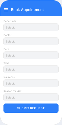
Lower decision cost. Focus on doctor-related info.
Usability tests: time to read volume & rating dropped ~1/3.
Usability tests: time to read volume & rating dropped ~1/3.
Where am I? The system shows you.
Long waits, booking flows and forms create anxiety — users need a progress bar and clear status to stay calm.
Inspired by Apple's Dynamic Island / Live Activities — the consult top bar surfaces progress so users know where they are instantly.
During a visit, the card shrinks to give the chat more room. Tap to open details in a secondary view.
A big leap in information efficiency
The clearest proof of an upgrade is the side-by-side. Booking went from a buried eleven-tap maze to a three-tap action on the home screen.
Surfaced on the home screen with smart defaults from visit history.
Clearer hierarchy and colour coding make important status easier to spot.
The product, screen by screen
Three flows: scan & book, consult, manage prescriptions, rebuild to a clearer interaction. Doctor portal now independent to another mini program, with a brand new home screen.
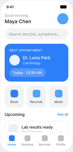
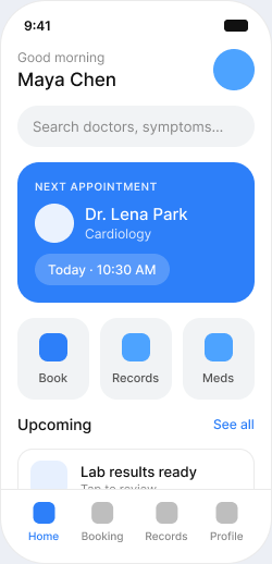
Home — next best action
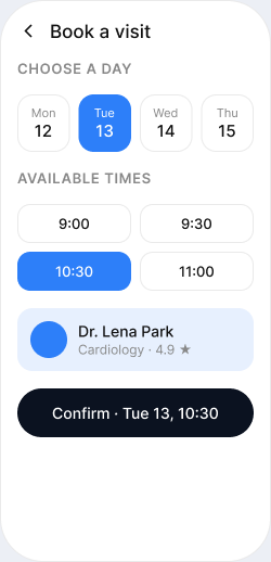
Booking — three taps to confirmed
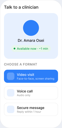
Telehealth — care in a minute
Results coming soon
The new interface is so much more intuitive — I no longer worry about missing important information.
Design complete
Key screens redesignedTest & review passed
Approved with PM tweaksFront-end dev
In developmentNationwide rollout
100+ sitesWhat I'd carry forward
Optimization is editing
Biggest wins came from removing steps — not adding features.
The system pays for itself
One token library kept three platforms in sync. Ship time −~⅓.
Trust is the real metric
In healthcare, calm clarity beats clever delight.